What’s the Difference Between a Wordmark and a Logo?

A wordmark, also known as a logotype, is a typographic representation of a brand’s name. It relies on typography, using unique fonts, colours, and spacing to create a memorable impression, without incorporating any symbols or icons.
When it comes to building a brand’s visual identity, the choice between a wordmark and a logo is crucial. While both have their merits, opting for a wordmark can offer several advantages.
Simplicity and Clarity
Wordmarks are inherently simple because they focus solely on the brand name using stylised typography. This simplicity can be a significant advantage in a world where consumers are bombarded with visual stimuli. A clean and clear wordmark ensures that your brand name is easily recognisable and memorable.
For example, Google’s straightforward and colorful typeface makes it instantly identifiable and easy to remember.

Strong Name Recognition
By using a wordmark, the emphasis is placed directly on your brand name, makng it the central element of your identity.. This can be especially beneficial for new brands trying to establish their name in the market.
For this reason, many start-ups opt for wordmarks, for example, Duolingo, Stripe and Webflow.

Versatility Across Media
A wordmark works well across various media and formats. Whether it’s on business cards, websites, vehicles, or adverts, a wordmark maintains its clarity and impact.
Take FedEx’s bold and simple logo, which works effectively across delivery trucks, packaging, and digital platforms.

Timeless Appeal
Wordmarks have a timeless quality, giving your brand a professional and enduring appeal that doesn’t quickly go out of style.
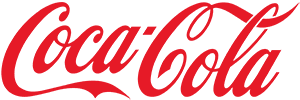
For example, Coca-Cola’s cursive typeface has remained largely unchanged over the decades.

Professional
Wordmarks are the natural choice for companies where a professional, clean look is essential.
Take the Deloitte and McKinsey logos, their clean and straightforward typeface-driven logos convey professionalism and reliability.

Conclusion
Opting for a wordmark instead of a complex, icon-centric logo ensures your brand name is consistently represented across all platforms. Wordmarks are versatile, easy to recognise, and provide strong name recognition while exuding professionalism. For startups with limited marketing budgets, a wordmark is the ideal choice.
Get started for free with LOGODEK.
